Reels-style viewing
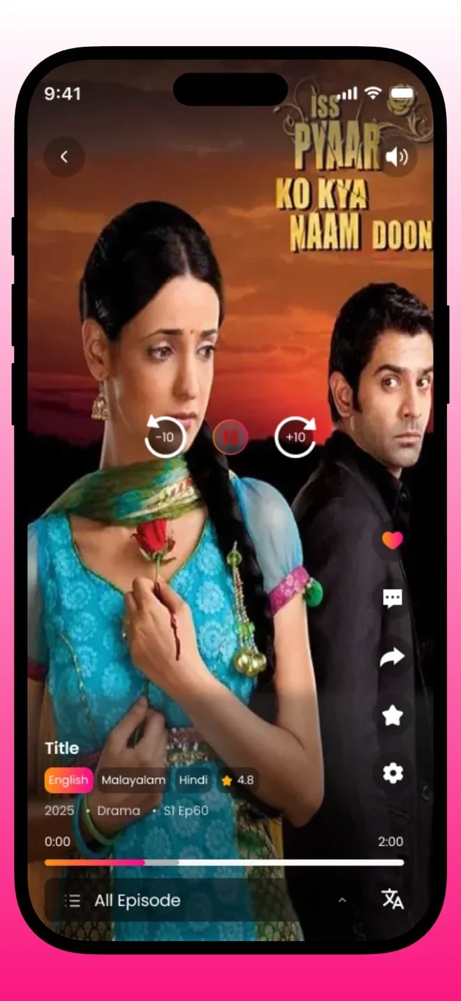
A vertical, full-screen player that plays on arrival, so there is nothing to tap before the story starts.


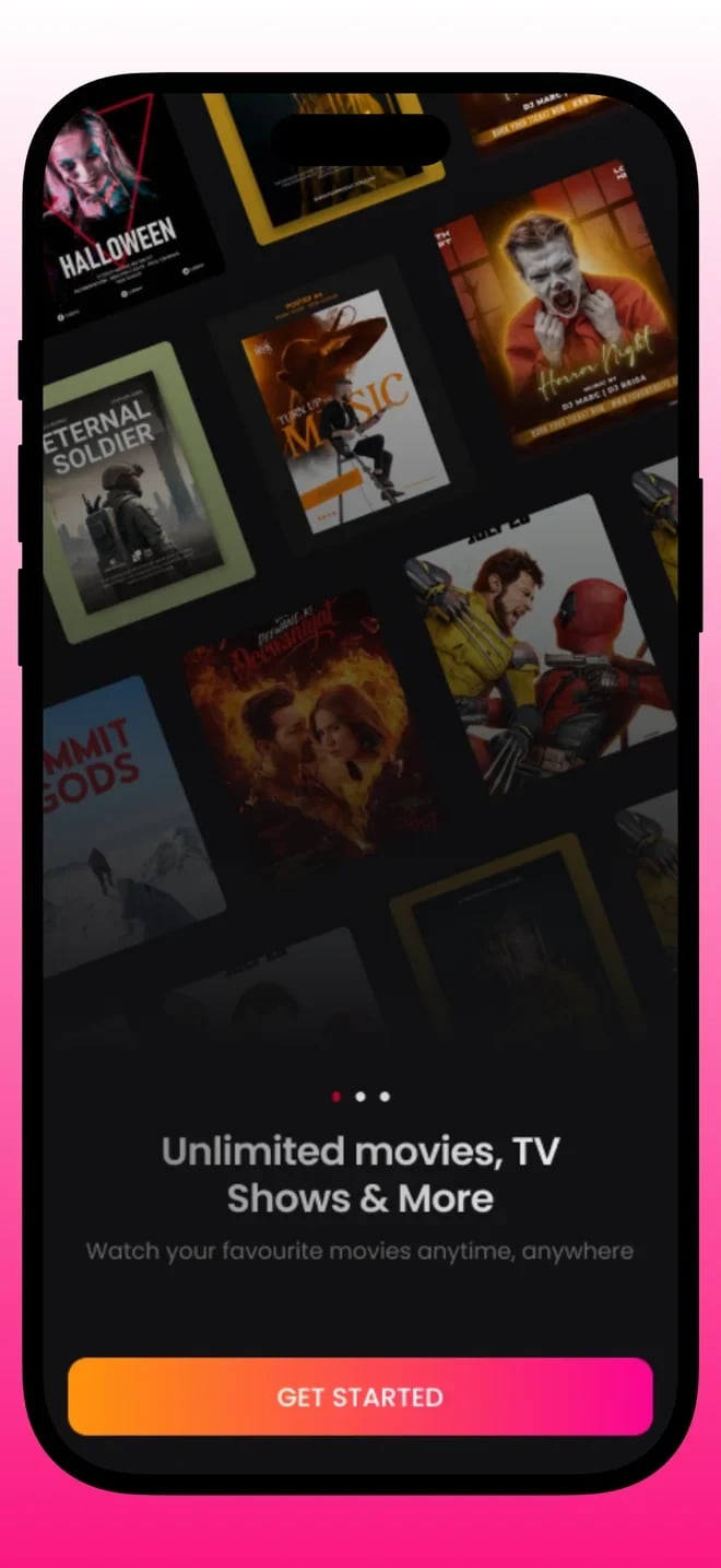
Reelio is an OTT platform that delivers bite-sized drama series in an immersive, reels-style feed. We designed and built the viewing experience so that a quick episode, a binge session and a late-night scroll all feel natural on a phone.
Why Reelio
The mobile experience
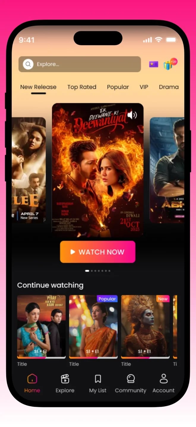
The home screen is where most sessions begin, so it is built to put a story in front of the viewer immediately. Featured series and fresh episodes are presented in a vertical flow, and the player starts as the content arrives rather than waiting for a tap. The aim is that opening the app and watching something are almost the same action.
Beneath the main feed, rows group dramas by mood and genre so that a viewer who is not sure what they want still has an easy way in. Artwork, titles and short descriptions are sized so they can be scanned at a glance, and nothing on the screen competes with the video itself.
We also thought about the order of things. The most valuable content is surfaced first, the controls a viewer needs most often sit within thumb reach, and secondary information is one gesture away rather than permanently on screen. That discipline keeps the feed readable even as the catalogue grows.
Every series has its own page that holds the story together. Episodes appear in order, the next one is always obvious, and a viewer returning after a few days can see exactly where they stopped. This is what separates a drama platform from a feed of unrelated clips.
The series page also carries the details that help a viewer decide: a synopsis, the category and the episode list. It is designed to answer the question of whether to start watching in a few seconds, then get out of the way.
The series page is also where the platform quietly teaches viewers how it works. Seeing episodes listed in order, with a clear indication of what has been watched, makes the structure obvious without a tutorial. A viewer who has never used the app understands within a few seconds that they can continue, restart or jump ahead.
The player is the heart of the product. It is designed to start quickly, keep buffering to a minimum and adapt to changing network conditions, because a viewer on mobile data should not have to think about their signal. When the connection drops, the player recovers instead of leaving the viewer staring at an error.
Controls are intentionally light. A viewer can pause, scrub and move between episodes, but the interface fades away during playback so the story fills the screen. Moving to the next episode takes a single gesture.
Testing this part of the product meant watching how real people behave on a bus or in bed, not just checking that video plays in an office. Small details, such as how quickly the first frame appears and what happens when a signal drops in a tunnel, made a real difference to how the product felt in use.
A catalogue is only valuable if people can find things in it. Reelio combines browsing and search so that both kinds of viewer are served: the person who wants to be surprised and the person who already knows what they are looking for.
Categories and curated rows make browsing feel guided, while search handles titles and keywords. Results are laid out with enough artwork and context to choose confidently, and returning to the home feed is always one step away.
Search is deliberately forgiving. Viewers rarely type exact titles, so the experience is designed to tolerate partial words and to fall back to related series when nothing matches precisely, which keeps people watching instead of leaving with an empty results page.
Viewers should not have to think about their account, but the product depends on remembering them. Their place in each series, the dramas they have saved and their preferences are tied to a profile that follows them between sessions and devices.
Signing up is kept short, and settings are limited to what a viewer actually needs. The goal is for the account to be invisible when things go well and helpful when they do not.
A good account area is mostly invisible, but it carries a lot of responsibility. It remembers what the viewer watched, keeps their saved series in one place and lets them pick up on a different phone. Getting those details right is part of why people come back.
Behind the viewing experience sits the tooling that lets the Reelio team publish. A drama platform lives on a steady flow of new series, so adding a series, ordering its episodes, setting artwork and choosing where it appears must be straightforward for non-developers.
Good tooling also protects quality. Clear structure for series, episodes and categories means the feed stays tidy as the library grows, and the team can change what is featured without waiting on a new app release.
Another benefit of good tooling is speed. When publishing a new series takes minutes rather than a developer's afternoon, the team can respond to what audiences are enjoying, schedule releases around events and keep the feed feeling fresh, which matters as much to retention as any feature in the app.
Overview
Short-form drama has changed how people watch stories. Instead of committing to a one-hour episode, a viewer opens an app, watches a few minutes of a series, and decides in the moment whether to carry on. Reelio was built for exactly that behaviour. It is an over-the-top platform whose catalogue is made of bite-sized drama series, presented in a vertical, reels-style format that feels familiar to anyone who has scrolled a short-video feed.
The brief was not simply to put videos on a screen. A streaming product lives or dies on how quickly it gets a viewer into a story and how gently it keeps them there. That meant treating the first second of playback, the way episodes connect to each other, and the path from opening the app to watching the next episode as the real design problem. Everything else, from the layout of the home feed to the structure of a series page, followed from that.
We worked on Reelio as a complete product rather than a single screen. The viewing experience, the catalogue structure, the account area and the content tooling behind the scenes all had to fit together, because a drama platform needs both a beautiful player and a reliable way for its team to publish new series. The result is an app that feels light in the hand and a platform that can keep growing its library.
What makes a short-drama product interesting from an engineering point of view is how much of the experience happens in the margins. The gap between two episodes, the moment a video buffers, the screen a viewer sees when they return after a week away: none of these is a headline feature, yet together they decide whether someone watches one episode or twenty. We spent as much time on those in-between moments as on the screens people would screenshot.
Scope
The challenge
The first challenge was attention. A short drama competes with every other thing on a viewer's phone, so the app has to earn the next minute again and again. If a video takes a moment too long to start, or the viewer has to hunt for the next episode, they leave. Reelio therefore needed a player that begins quickly, keeps the controls minimal and moves from one episode to the next with almost no friction.
The second challenge was the network. Many viewers watch on mobile data, on the move, and connection quality changes from minute to minute. A video product that assumes fast, stable internet will stall in exactly the moments people are most likely to watch. Playback had to adapt to the connection, buffer sensibly and recover gracefully instead of freezing or showing an error.
The third challenge was structure. A feed of clips is easy to build, but a drama is a sequence. Viewers need to know which series an episode belongs to, what comes next, and where they left off. Reelio had to feel as effortless as a feed while keeping the order and continuity of a proper series, and the content team needed a way to organise that catalogue without developer help.
The fourth challenge was keeping the product simple while it grows. Every new capability, from categories to recommendations to new ways of paying, pulls the interface toward clutter. We set a rule early that anything added to the viewing screens had to justify the space it took from the story, and that rule shaped the structure of both the app and the content tooling.
Engineering
Video delivery shaped the architecture. Content is prepared and served so that playback starts quickly and adapts to the connection, which is the single biggest factor in whether viewers stay.
Series, episodes and categories are modelled explicitly instead of as a flat list of videos. That is what makes resume, next-episode and curated rows possible, and it keeps the content team organised.
The mobile apps and the web experience share the same catalogue and accounts. New content appears everywhere at once, and the team maintains one source of truth.
The apps are kept lean so they open fast on mid-range phones, which many viewers use. We avoid heavy screens and unnecessary animation that slow down the first moment of playback.
Products like this often add subscriptions, paid episodes or advertising over time. The structure leaves room for those options without forcing them on day one.
We plan for logging and monitoring around playback so that problems with streaming or the catalogue are visible quickly, instead of being discovered through user complaints.
Design principles
Every second before a story begins is a chance for a viewer to leave, so we treated time to first frame as a core measure of quality. The player starts on arrival, controls fade away and nothing stands between the viewer and the drama.
Viewers who start a drama expect to be able to finish it, in order, without effort. Giving every series a clear structure, a resume point and an obvious next episode is how the product keeps that promise.
Reelio assumes a modest phone and an unreliable connection, because that is what many viewers have. Light screens, adaptive streaming and graceful recovery are part of the design, not optimisations added at the end.
We resisted decoration. A quiet interface lets artwork and stories carry the screen, and it keeps the product readable as the catalogue grows. Anything that did not help a viewer watch or choose was removed.
A streaming platform is only as fresh as its publishing workflow. We designed the tooling so that adding and arranging content is simple for non-developers, because a feed that updates often is a feed viewers return to.
The first version focuses on watching, but the structure keeps space for subscriptions, paid episodes or advertising. Planning for monetisation early avoids painful rework later, without forcing it on viewers before they are ready.
Process
We start by understanding the audience, the kind of dramas planned and how people will watch. We review comparable short-drama apps and agree what Reelio should do better.
We design the home feed, series page and player as clickable prototypes, then test the flow on real phones. The aim is to prove that starting a story feels instant before any code is written.
We model series, episodes and categories, set up the backend and prepare the content tooling so that the team can begin loading real material early.
The apps are built in short sprints. At the end of each sprint there is a working build to watch on a real device, so feedback arrives while changes are still cheap.
We test playback on different phones and networks, tune loading and buffering, and fix rough edges in navigation. Weak-network behaviour gets particular attention.
We prepare the store releases, monitor the first weeks of real usage and keep improving. A streaming product keeps changing as its library and audience grow.
Screens
Who uses it
The people watching on their phones. They need fast playback, clear series, an easy way to find the next story and an account that remembers their place. Every design decision starts from the viewer.
The people who publish dramas. They need a dependable way to add series and episodes, set artwork and decide what appears on the home feed, without involving developers each time.
The people responsible for growth. They need a platform that can add new categories, test new ways to present content and eventually support new ways to earn, without rebuilding the app.
The people who keep the service healthy. They need clear information about content and accounts so that when a viewer reports a problem, it can be understood and fixed quickly.
Quality and trust
Playback is checked on a range of phones, not only the newest, because performance on mid-range hardware decides the experience for many viewers.
We test on slow and unstable connections and fix stalls, so a weak signal slows the video rather than breaking the app.
Access to content is controlled by the platform, and the catalogue tooling is limited to the team members who need it.
We collect only what the product needs to remember a viewer, and we keep account data protected.
Touch targets, text sizes and contrast are chosen so the interface works for a wide range of viewers and lighting conditions.
Once live, errors and playback problems are tracked so they can be fixed quickly and the experience keeps improving.
“ReeLio was a big, messy build, and I changed my mind many times. Any other team would have given up on me. These guys argued with me when I was wrong, agreed when I was right, and kept building. I respect that a lot.”
Dev Jung
ReeLio
Looking back
Reelio is a reminder that a streaming product is judged in its first few seconds. Everything that happens before a story begins, from opening the app to choosing a series, is friction the viewer feels. Cutting that friction down to almost nothing was the most valuable work on the project, and it is a principle we carry into other media and entertainment products.
It also showed the value of treating a drama as a series and not a clip. Giving episodes order, a home and a resume point is what turns a feed of short videos into something people return to. If you are planning a streaming or content product, we would be glad to talk through how it could be shaped.
Finally, Reelio underlines how much a product benefits from honest constraints. Designing for a phone, for a short attention span and for variable networks gave us a clear filter for every decision. Products that try to be everything for everyone rarely feel good in the hand. Reelio chose its audience and its moment, and the interface is better for it.
Straight answers about how a product like this is planned, built and launched.
A small senior team, a developer assigned within 48 hours, and source code that is yours on full payment.
“Simple. Fast. My customers don't want to think, they want momo at midnight. The app does that.”
You can also write to us at hello@inflancer.com and our team will get back to you right away.
Caller ID App
Callexa is a communication platform that makes calls more meaningful, organised and transparent. Callers add a reason, recipients see it before they pick up, and calling, chatting, sharing and community support live together in one app.
Ride Sharing App
Yatra is a ride-sharing app for bikes, cars and parcels. Riders set a pickup and drop-off, choose a ride and a fare, and follow their driver live on the map. Behind it sits the driver app and the operations tooling that keep a marketplace of trips running.
Flight Booking App
Damiticket is a flight booking platform for Nepal. Travellers search domestic flights, compare fares and classes across airlines and book in a few taps. We designed the search, comparison and booking journey so that choosing a flight feels as simple as it should.