

Know why someone is calling, before you answer.
Callexa is a communication platform that makes calls more meaningful, organised and transparent. Callers add a reason, recipients see it before they pick up, and calling, chatting, sharing and community support live together in one app.
- Industry
- Communication and social
- Platforms
- iOS, Android, Web
- Market
- Nepal
Overview
The Callexa story
Everyone knows the small tension of an unknown number ringing. Is it urgent, a delivery, a mistake, or a sales call? Callexa starts from that feeling. Its central idea is simple and human: let the caller tell the person why they are calling, and let the recipient see that reason before deciding whether to answer. The tagline, know why before you answer, sums up the product.
Around that idea, Callexa grew into a fuller communication platform. Users can chat one to one or in groups, make audio and video calls, build a profile and share posts, stories and short videos. They can search for people, find friends nearby and see who has viewed their profile. And the platform supports community-focused features such as blood donation posts and requests, so the network can also help people when support is needed.
We worked on Callexa as a complete product, from the call experience and the messaging layer to the profile and community features and the controls behind them. The challenge was to keep a product with this many parts feeling like one clear idea. Each feature had to reinforce the promise of calls and conversations that are more transparent, and none of them could make the app feel crowded.
The founder's own description of the goal was to make communication more meaningful, organised and transparent. That became our filter. When a feature helped people understand each other before, during or after a call, it belonged. When it only added activity for its own sake, it did not, and that restraint is part of why the product feels coherent.
Why Callexa
What the product gets right
Calls with a reason
A caller can say why they are calling, so the person on the other end answers with context and not guesswork.
Calling and chat together
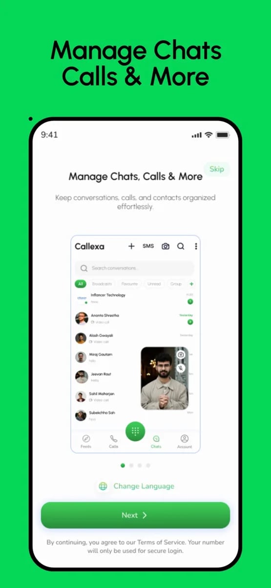
One-to-one chats, group chats, audio calls and video calls sit in one app instead of three.
Profiles that mean something
Each user has a profile with posts, stories and short videos, so people know who is on the other end.
Discovery without noise
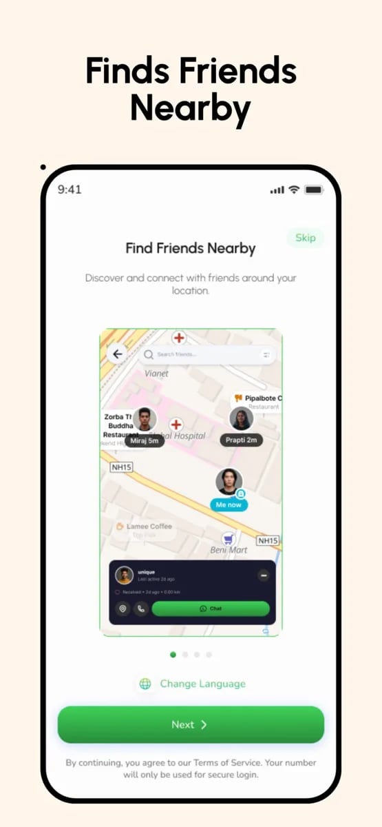
Search, profile discovery and nearby-friend features help people find each other on their own terms.
Community support
Blood donation posts and requests turn the network into a way to help people in real situations.
User control
People decide how they communicate and what they share, rather than being forced into one style.
Awareness of attention
Seeing who viewed a profile and why someone is calling respects the recipient's time and curiosity.
Built for Nepali networks
The experience is tuned for the connection quality and devices most users actually have.
The mobile experience
A complete journey, screen by screen
A call that arrives with context
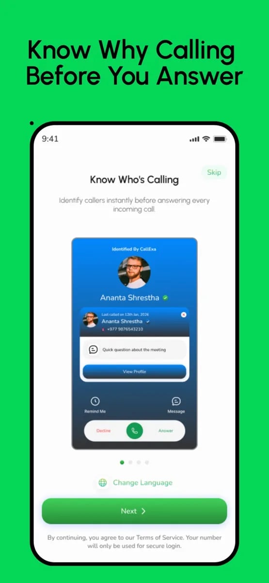
The signature moment in Callexa is the ring. Before placing a call, the caller can attach a reason, and when the recipient's phone rings they see it alongside the caller's name and profile. Instead of a bare number and a guess, they see a purpose, and can decide in a second whether to pick up now, later or not at all.
The flow for adding a reason is designed to take a few taps. Common reasons can be chosen quickly, and a custom note is available when the situation needs it. The goal is for it to feel like a natural part of calling, not a form to complete.
For the recipient, the same screen offers everything needed to act: the reason, a recognisable profile and clear answer and decline controls. Over time, the reasons also build a record that makes returning a call much easier.
- Reason attached before ringing
- Caller profile on the incoming screen
- Quick, tappable common reasons
- Clear answer and decline actions
The challenge
What had to be solved
The first challenge was making call reasons feel natural. Asking a caller to type a reason before ringing is extra effort, and if it feels like a chore, people will skip it. The flow had to be fast enough that adding a reason takes a moment, and rewarding enough that recipients visibly benefit, so the habit forms on both sides.
The second challenge was real-time reliability. Calls and chats are unforgiving. A message that arrives late or a call that fails to connect breaks trust immediately. The product depends on signalling, notifications and media delivery working together on phones that are locked, in the background or on unsteady mobile data, and each of those states needed careful handling.
The third challenge was breadth without clutter. Calling, messaging, social posting, discovery and community requests are each complete products in their own right. Putting them in one app risks a screen full of tabs and badges. We had to give each area a clear home and a clear purpose, and keep the first screen simple enough that a new user is never lost.
The fourth challenge was trust and safety. A platform that connects strangers needs sensible controls: the ability to decide who can reach you, to block and report, and to manage what is shared. Community features such as blood requests add another layer of responsibility, because the information in them needs to be clear, current and handled with care.
Project goals
- Let callers add a reason that recipients can see before answering.
- Bring chats, group chats, audio calls and video calls into one dependable app.
- Give every user a profile with posts, stories and short videos.
- Make people easy to find through search, discovery and nearby friends.
- Support community needs such as blood donation requests.
- Give users control over how they communicate and what they share.
Scope
What a product like this covers
Calls with a reason
Callers attach a reason and recipients see it before answering.
Audio and video calls
Dependable calling with simple in-call controls.
One-to-one chat
Real-time messaging with an organised conversation list.
Group chats
Small group conversations for friends, families and teams.
Profiles
Posts, stories and short videos that show who a person is.
Profile views
Awareness of who has viewed a profile.
Search and discovery
Find people by name and browse profiles.
Nearby friends
Optional, user-controlled discovery of people in the area.
Blood donation requests
Posts and responses that connect people in need with donors.
Privacy controls
Control over who can contact, see and find a user.
Block and report
Tools for users and moderators to handle unwanted behaviour.
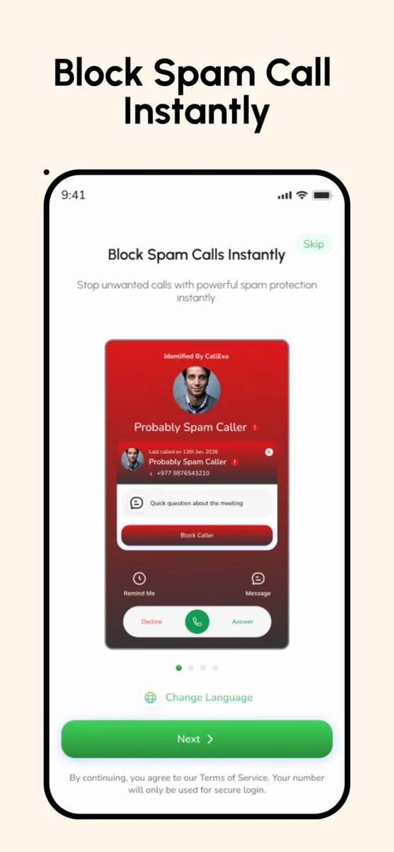
Spam protection
Instant spam-call blocking, so unwanted callers are stopped before they interrupt.
Design principles
The rules we designed by
Context beats interruption
Every interruption should arrive with enough information to be handled. That principle drove the call reason, the caller profile on the ringing screen and the history that follows. A ring that explains itself is far less stressful than one that does not.
Fast for the sender, useful for the receiver
A feature that costs the sender effort must clearly benefit the receiver, or people will skip it. We tuned the reason flow until adding one took only a moment, and made sure the recipient could see exactly what it added.
Reliability is a feature
In a communication product, the quality of a call or message is the product. We treated delivery, ringing and connection handling as first-class work, ahead of cosmetic polish, and tested them in the awkward conditions real people use.
Social, but never loud
Profiles, stories and discovery give the app warmth, but none of them is allowed to shout. Notifications are measured, activity is optional and the user always has a quiet mode, so the social layer supports the main purpose instead of competing with it.
Privacy as a default
Who can call, who can see a profile and whether location is shared are all in the user's hands. Making privacy easy to understand, and easy to change, builds the trust that a product built on personal conversations depends on.
Space for community
The blood donation feature shows that a communication network can do more than entertain. We designed the community layer so that it can carry serious, time-sensitive posts without being buried by everyday social content.
Engineering
The decisions behind the build
Real-time signalling
Calls and chats depend on dependable real-time connections. We designed the signalling and notification layer so that calls ring and messages arrive even when the app is in the background.
Call reasons as data
Reasons are stored with each call, which makes them visible on the incoming screen, in history and in later features such as filtering or summaries.
Media handling
Posts, stories and short videos need efficient upload, processing and delivery. The pipeline keeps files light and fast to load on mobile networks.
Presence and privacy
Online status, profile views and nearby features are all optional and controllable, which is both good design and a sensible approach to personal data.
Moderation from day one
Reporting, blocking and review tools are part of the platform, so the team can respond to misuse before it affects the community.
One account, many surfaces
The same identity powers calls, chat, profile and community features, which keeps the product coherent and the data consistent.
Who uses it
Built for every side of the product
Callers
People who start conversations. They need a fast way to add a reason, a reliable connection and a simple record of who they called and why.
Recipients
People who receive calls and messages. They need context before they answer, control over who can reach them and a quiet way to decline.
Community members
People who post and respond to requests such as blood donation. They need clarity, speed and trust in the information they see.
Moderators and administrators
The team that keeps the platform healthy. They need tools to review reports, manage accounts and respond quickly when something goes wrong.
Process
From brief to live release
- 1
Concept and scope
We worked with the founder to sharpen the central idea, decide which features belong in the first release and write a scope that kept the product focused.
- 2
Experience design
We prototyped the call, chat and profile flows and tested them on real phones, paying special attention to the incoming-call screen.
- 3
Platform foundations
We set up accounts, real-time messaging, calling and notifications first, because the rest of the product relies on them.
- 4
Feature build
Profiles, posts, stories, discovery and community requests were built in short sprints, each ending with a working build to try.
- 5
Testing on real conditions
We tested calls and messages with locked screens, poor networks and background states, since those are where communication apps fail.
- 6
Launch and iteration
We prepared store releases, watched early usage closely and kept refining the flows people used most.
Screens
Callexa app screenshots
Quality and trust
How we keep it reliable
Call reliability testing
Incoming calls are tested across device states and networks, because a missed call undermines the whole product.
Message delivery checks
We verify ordering, delivery and notifications so conversations stay accurate and timely.
Privacy by design
Visibility, location and contact settings are controlled by the user, and sensitive data is handled carefully.
Abuse prevention
Blocking, reporting and review tools give users and moderators ways to deal with unwanted behaviour.
Performance on modest phones
Screens and media are kept light so the app remains responsive on mid-range devices.
Monitoring
After launch, errors in calling and messaging are tracked so they can be fixed quickly.
“I had this idea for years: you should know why someone is calling before you pick up. Many people told me it was too hard to build. Calls, video, chat and a social feed, all working together. The Inflancer team made it real. The first time I saw a call come in with the reason showing, I just sat there for a minute.”
Jeevan Raut
Founder, Callexa App Pvt. Ltd.
Looking back
What this project taught us
Callexa began with a small, human observation about unknown calls and grew into a communication platform. The lesson for us was how powerful one clear idea can be as an organising principle. Because everything in the product connects back to understanding each other before and during a conversation, the many features feel like parts of one thing.
It also reinforced how much trust matters in communication products. People will only use an app for calls and conversations if it rings when it should, delivers what it promises and respects their choices. We treated reliability and privacy as core features, not afterthoughts, and that is the standard we aim for with any product that connects people.
If you are planning a communication, social or community product, we would be happy to talk about how to find its central idea, shape the first release and build it so that it holds up in the real world.
A final reflection is on how much an app like Callexa depends on habit. Features like call reasons only matter once people use them every day, so the first weeks of a real launch teach more than any prototype. We plan for that learning, watching which flows people adopt and refining the ones they do not, so the product keeps getting closer to how conversations really happen.
About the Callexa project
Straight answers about how a product like this is planned, built and launched.
Still exploring? Let us help.
A small senior team, a developer assigned within 48 hours, and source code that is yours on full payment.
“Simple. Fast. My customers don't want to think, they want momo at midnight. The app does that.”
You can also write to us at hello@inflancer.com and our team will get back to you right away.
More case studies
Ride Sharing App
Yatra
Yatra is a ride-sharing app for bikes, cars and parcels. Riders set a pickup and drop-off, choose a ride and a fare, and follow their driver live on the map. Behind it sits the driver app and the operations tooling that keep a marketplace of trips running.
Flight Booking App
Damiticket
Damiticket is a flight booking platform for Nepal. Travellers search domestic flights, compare fares and classes across airlines and book in a few taps. We designed the search, comparison and booking journey so that choosing a flight feels as simple as it should.
Food Delivery App
Hungry Nepal
Hungry Nepal is a Chitwan-region multi-restaurant delivery platform serving Hetauda with food, drinks and snacks around the clock. We built the customer app, the restaurant partner app and the rider app so that orders flow from a hungry customer to a delivered door without anyone writing anything down.