One search, every airline
Travellers see domestic flights from several airlines together, instead of visiting each airline separately.


Damiticket is a flight booking platform for Nepal. Travellers search domestic flights, compare fares and classes across airlines and book in a few taps. We designed the search, comparison and booking journey so that choosing a flight feels as simple as it should.
Overview
Booking a domestic flight in Nepal has long involved a patchwork: checking one airline's schedule, calling a travel agent, comparing prices by hand and hoping that the seat is still there. Damiticket replaces that patchwork with one place to search, compare and book. A traveller enters where they are going and when, sees flights from the airlines operating that route, compares fares and classes, and books in a few taps.
The promise is speed and clarity. In travel, the most valuable thing a product can offer is confidence: confidence that the price is correct, that the seat is real and that the ticket will be ready on the day. Damiticket is designed around building that confidence at each step, from the first search to the confirmation screen, so that a traveller never has to wonder whether something has gone wrong.
We built the product as a complete booking journey for phones and the web. That includes the search experience, the results and fare comparison, the passenger details and payment steps, and the area where trips are stored afterwards. A booking platform is only as good as the weakest of these, so we designed them together and tested them as one continuous flow.
Travel booking is a particularly unforgiving domain. People often book under time pressure, with money at stake, and they remember a bad experience for a long time. That is why we spent as much effort on error handling, clarity of language and the small reassurances along the way as we did on the headline features. In a booking product, trust is the feature.
A last point about the product is its audience. Travellers in Nepal range from frequent business flyers to families booking once a year, from people comfortable with apps to people using one for the first time. The design needed to feel instantly familiar to all of them, which meant leaning on clear patterns and plain words and avoiding clever interactions that might confuse.
Scope
Origin, destination, date and travellers with quick repeat searches.
Flights from several airlines in one list, with times and fares.
Consistent presentation of classes and prices to compare fairly.
Control by airline, time window and price.
Schedule, class and a transparent price breakdown before booking.
Validated forms and remembered traveller information.
A calm, familiar payment step with clear confirmation.
Booking confirmation and ticket details kept in the app.
Upcoming and past bookings in one place.
Space for promotions and stored balances when the business is ready.
A clear path to help for changes and questions.
Tools for the team to see bookings, manage content and review performance.
The mobile experience
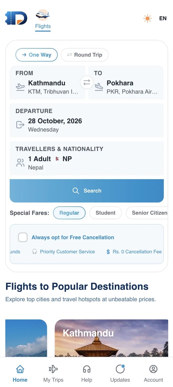
The search screen asks for only what is needed: where from, where to, the date and the number of travellers. The fields are large, the airports are easy to pick and sensible defaults keep the effort low. A returning traveller can start a familiar search in seconds.
Date selection is designed for real planning. A calendar makes it easy to pick a day, and the design leaves room for travellers who want to look at neighbouring dates when prices or availability matter.
The result is a search experience that feels closer to a conversation than a form. The traveller says where they want to go, and the product responds with real options.
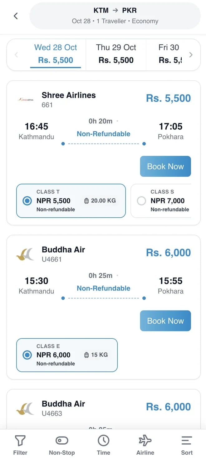
Search results bring flights from different airlines onto one list, sorted so that the most relevant options are visible first. Each result shows the essentials: airline, departure and arrival times, duration and the starting fare. A traveller can scan the list and form a view in seconds.
Fare classes and price differences are laid out so they can be compared without opening each flight in turn. The cheapest, the fastest and the most convenient options can be told apart quickly, which is exactly what comparison is for.
Filters and sorting give control to travellers who care about specific things, such as a particular airline or a time window, without overwhelming those who just want the best simple choice.
Before committing, a traveller needs the full picture. The flight details view shows the schedule, the class, what is included and the price breakdown. Anything that affects the decision is visible here, so there is no surprise later.
Clarity of language matters in this screen. Terms are written for travellers rather than for the industry, and the total is always shown plainly. A price that someone understands is a price they are willing to pay.
From here the next step is obvious: continue to passenger details. The screen leads forward without pressure, and going back to compare other options is just as easy.
Booking a flight needs accurate passenger information, so this step has to be quick and careful. The form is short, fields are labelled clearly and validation helps people correct mistakes as they type, instead of discovering them at the end.
Returning travellers benefit from remembered details, which turns repeat bookings into a matter of seconds. For group bookings, adding several travellers is organised and easy to review.
Before payment, a summary pulls everything together: the flight, the travellers and the total. It gives the traveller a last chance to check and a clear sense that the booking is about to be confirmed.
Payment is the moment of highest doubt, so the experience is deliberately calm. The total is visible, the payment options are familiar and the screen avoids distractions. A traveller should always know what they are paying for and what happens next.
On success, the confirmation is immediate and unmistakable. The booking appears in the traveller's trips, and the ticket details are available straight away. If something fails, the message explains what happened and what to do, instead of leaving people uncertain about whether they have been charged.
Behind the scenes, the payment and booking steps are coordinated carefully so that a seat and a payment stay in step, which is one of the most important reliability concerns in any travel product.
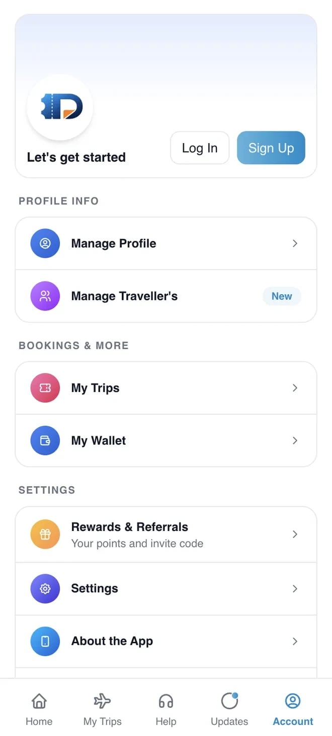
After booking, the traveller needs an easy way back to their details. The trips area lists upcoming and past bookings, with the information needed at the airport: the flight, the time and the ticket. Everything is a tap or two away.
A good trips area also reduces the load on support. When travellers can see their own booking details and status, they ask fewer questions, and the questions they do ask are easier to answer.
The same area is a natural home for later capabilities, such as changes, reminders and offers, which can be added without reworking how bookings are shown.
Travel plans change, and a booking product earns loyalty by how it behaves when they do. The support path is visible from the trips area, so a traveller who needs to ask a question or change something does not have to search for a phone number or an email address.
Behind that path, the team needs the right information. Clear booking details, statuses and history make it possible to answer quickly and accurately, and reduce the back-and-forth that frustrates both travellers and staff.
Over time, the same area can grow to include self-service actions, reminders before departure and notifications about schedule changes, turning the app from a booking tool into a travel companion.
Why Damiticket
The challenge
The first challenge was comparison. Airlines present their fares and classes differently, with different names, rules and baggage allowances. To let a traveller compare fairly, the product had to present them in a consistent way without hiding the differences that genuinely matter. The comparison view needed to be both simple and honest.
The second challenge was availability and accuracy. Flight inventory changes constantly, and a seat that appears available at the start of a search might be gone by the time the traveller is ready to pay. The experience had to handle that reality gracefully, keeping information current and explaining clearly when something changes.
The third challenge was a short, reliable booking flow. Every extra field and every unclear step costs bookings. At the same time, a flight booking needs accurate passenger details and a secure payment step. We had to find the balance between a flow that is quick and one that collects exactly what is required, no more and no less.
The fourth challenge was trust. Travellers are being asked to pay for something they cannot see yet. Clear summaries, familiar payment patterns and visible confirmations help, but they only work if they appear at the right moments. We designed the reassurance into the flow so it arrives when doubt is most likely to appear.
Engineering
Airline data arrives in different shapes. The platform normalises it into one consistent model so results, fares and classes can be compared fairly.
Availability and prices change constantly, so the system refreshes data at the moments that matter and handles changes gracefully during booking.
The booking and the payment are coordinated so that a traveller is never charged without a booking or booked without a charge.
Search is tuned for speed, because slow results are one of the quickest ways to lose a traveller.
The apps and the web share one platform, so bookings and accounts are consistent everywhere.
Booking funnels and errors are tracked so problems with a particular route, airline or payment step are visible quickly.
Airports, airlines and routes are modelled with stable identifiers, which keeps search, results and bookings consistent across the apps and the web.
If one airline source is slow or unavailable, the platform keeps showing results from the others and says so clearly, instead of failing the whole search.
Design principles
People book flights when they feel sure. Every screen is judged by whether it makes the traveller more sure or less sure, and anything that adds doubt is rewritten or removed.
Comparison is the heart of the experience, but too many details make it useless. We show the differences that matter, in a consistent layout, and keep everything else one tap away.
We ask for as little as possible, and make sure each field is clear and validated. A short form that is easy to complete beats a long one that is easy to abandon.
Travel is full of jargon. We use words travellers already understand, and explain anything that affects the price or the rules.
Sold-out seats, price changes and failed payments will happen. Designing for them from the start, with clear messages and sensible recovery, is what separates a dependable product from a frustrating one.
Many travellers book on the go, on modest phones. We keep the screens quick and the pages light so that booking feels instant and stays reliable on weaker connections.
Process
We study how people in Nepal currently search and book domestic flights, and where the friction is, before designing anything.
We prototype search, comparison and booking as one flow and test it, so that decisions about layout are based on how people actually choose.
We build the airline connections and the booking and payment foundations first, because the rest of the product depends on them.
The mobile apps and the web experience are built in short sprints with a working version to review each time.
We test sold-out seats, price changes, failed payments and slow networks as carefully as the happy path.
We support the release and use real booking data to refine search, comparison and checkout over time.
Screens
Search
Results
Booking
Who uses it
People booking domestic flights for work, family or leisure. They want fast search, honest comparison and a booking they can trust.
People who book often and want remembered details, quick searches and easy access to past trips.
The team that helps with questions and changes. They need clear booking information so they can resolve issues quickly.
The business behind Damiticket. They need visibility of bookings and performance, and tools to manage the platform as it grows.
Quality and trust
We test the whole path from search to confirmation, including the unusual cases, so bookings are dependable.
Fares, taxes and totals are verified so that what travellers see is what they pay.
Payment steps follow secure practices, and sensitive details are handled by trusted providers.
Search and checkout are tuned for quick response on ordinary phones and connections.
We review messages, errors and confirmations so that they are understandable to a first-time traveller.
After launch, booking errors and drop-off points are tracked so the team can act on them quickly.
Looking back
Damiticket is a reminder that in travel, the best interface is often the one that quietly removes doubt. The product does not need to be flashy. It needs to show the right flights, make the price clear and take a traveller to a confirmed booking without surprises. Doing that well takes a great deal of design and engineering care, most of which the traveller never sees.
The project also showed how valuable it is to design for imperfect moments. Seats sell out, prices shift and signals drop. The experience we are proudest of is how calmly the product handles those moments, because that is when trust is won or lost.
If you are planning a booking or marketplace product, whether for flights, tickets or services, we would be glad to talk about how to shape the search, comparison and checkout journey so that it earns confidence from the first screen.
One more thing worth noting is how much a booking platform benefits from being built to grow. New airlines, new routes and new services can be added when the foundations are clean. That is why we modelled the data carefully from the beginning, so the product can expand without being rebuilt.
Straight answers about how a product like this is planned, built and launched.
A small senior team, a developer assigned within 48 hours, and source code that is yours on full payment.
“Simple. Fast. My customers don't want to think, they want momo at midnight. The app does that.”
You can also write to us at hello@inflancer.com and our team will get back to you right away.
Caller ID App
Callexa is a communication platform that makes calls more meaningful, organised and transparent. Callers add a reason, recipients see it before they pick up, and calling, chatting, sharing and community support live together in one app.
Ride Sharing App
Yatra is a ride-sharing app for bikes, cars and parcels. Riders set a pickup and drop-off, choose a ride and a fare, and follow their driver live on the map. Behind it sits the driver app and the operations tooling that keep a marketplace of trips running.
Food Delivery App
Hungry Nepal is a Chitwan-region multi-restaurant delivery platform serving Hetauda with food, drinks and snacks around the clock. We built the customer app, the restaurant partner app and the rider app so that orders flow from a hungry customer to a delivered door without anyone writing anything down.