

Pokhara's online kirana store, at your door in under an hour.
OK Pasal is a digital retail platform based in Pokhara that delivers fresh groceries, household essentials and snacks in about thirty minutes to an hour. We built the shopping app and the rider delivery app so that everyday shopping becomes effortless, transparent and reliable.
- Industry
- Grocery and local commerce
- Platforms
- iOS, Android, Web
- Market
- Pokhara, Nepal
Why OK Pasal
What the product gets right
A kirana store on your phone
The familiar range of a neighbourhood shop, from vegetables to household items, available in one app.
Delivery in about an hour
Orders are designed to arrive in thirty minutes to an hour, fresh and on time.
Clear, fair prices
Prices, discounts and totals are visible at every step, with no surprises.
Easy for the whole family
A simple interface that parents, students and professionals can all use without help.
Wishlist and cart
Customers keep favourite items and move them into an order when they are ready.
Rider delivery app
Riders get orders instantly, navigate to customers and prove delivery in the app.
Proof of delivery
Photos or signatures confirm that an order has arrived, which protects customers and the business.
Rooted in Pokhara
A local team and local knowledge shape how the service works day to day.
Overview
The OK Pasal story
OK Pasal was founded on a simple commitment: to make everyday shopping effortless, transparent and reliable for Nepali consumers. The platform combines the convenience of an app with the reliability of local stores. Fresh fruits and vegetables, dairy, grains, household supplies, snacks and kitchen essentials are all available in one place, and delivered to the door in Pokhara and beyond.
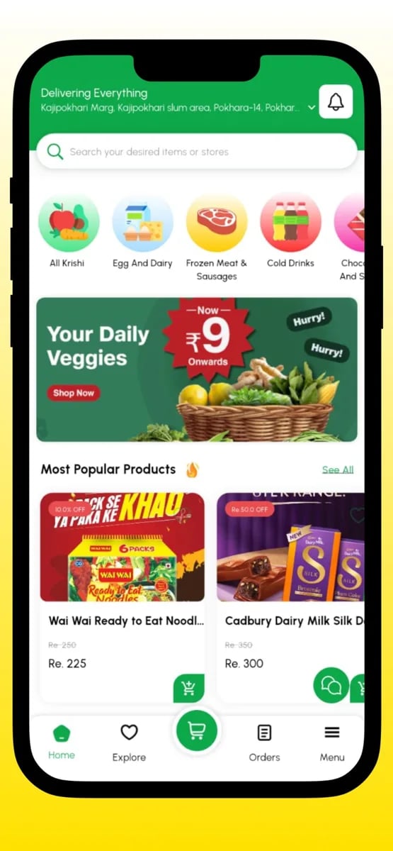
The experience is designed to fit the rhythm of ordinary life. The home screen invites a customer to start shopping straight away, with search at the top, categories as large icons and highlighted collections such as daily vegetables and the most popular products. Category pages promise delivery within a short window and make it easy to add items with a single tap. Item pages show sizes and prices, and the cart brings it all together.
Behind the customer app is a second app for the riders who carry out the deliveries. The OkPasal Delivery app is built for simplicity and speed, giving riders real-time order notifications, complete order details, navigation, guided delivery steps, proof of delivery, payment collection and a dashboard of their daily work and earnings. It turns a rider's phone into everything they need for the job.
The co-founder offered a simple test of whether the product worked: if their mother can order groceries on it, anyone can. We took that as a design brief. Every flow in the customer app had to be understandable without instruction, forgiving of mistakes and quick enough that a busy household would choose it over a trip to the shop.
What makes a local grocery app special is the relationship it supports. A neighbourhood shop earns loyalty by remembering what its customers like and treating them fairly. We designed OK Pasal so that the app can do the same: familiar categories, saved addresses and simple repeat orders make the service feel personal, even though the person ordering never speaks to anyone.
The mobile experience
A complete journey, screen by screen
Start shopping in one tap
The home screen greets the customer with the things they came for. A search field sits at the top, categories are large and recognisable, and a collection of daily vegetables and popular products invites browsing. A strip at the top reminds customers of where they are delivering to.
Offers and highlights are visible without crowding the screen. A customer who wants a quick top-up can search and add an item in seconds, while someone planning a weekly shop can browse by category.
The design assumes a short attention span and a busy day, so the first screen does as much work as possible and gets out of the way.
- Search at the top
- Large category icons
- Daily vegetables and popular items
- Delivery location always shown
Browsing aisles on a small screen
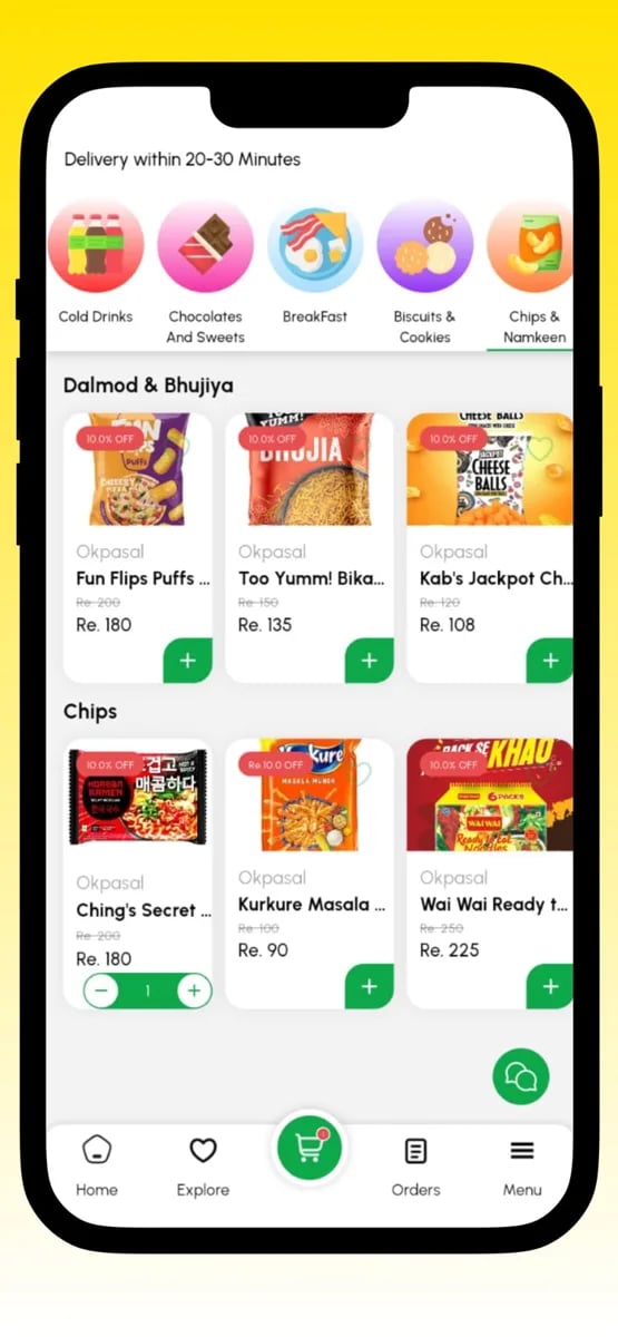
A category page works like an aisle in a shop. Items appear in a clear grid with names, sizes and prices, and a single add button on each product lets customers fill a basket quickly. A banner on the page reminds shoppers that delivery is within a short window.
Sub-categories, such as dals, chips, breakfast and cold drinks, help customers move through a large catalogue without scrolling endlessly. Quantity controls appear in place once an item is added, so changes are instant.
The page is built for scanning. Names are readable, prices are prominent and nothing competes with the products themselves.
- Product grid with prices
- One-tap add
- Sub-categories
- Quantity controls in place
Item details with the right choices
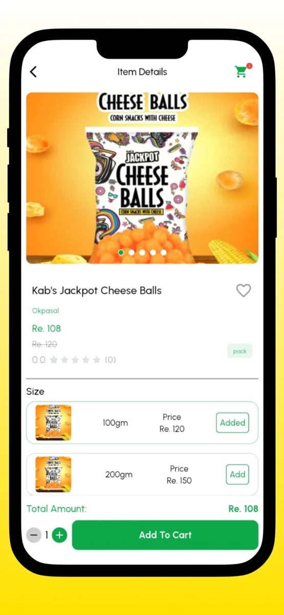
When a customer wants to know more, the item page gives them a larger image, the brand, the price and the choice of size. Selecting between a smaller and a larger pack is a single tap, and the price updates at once.
Information is presented plainly, so that a customer can decide without opening anything else. The total amount for the chosen quantity is visible, and a bold add-to-cart button completes the action.
For households watching their spending, clarity at this point matters. Seeing the price per pack and the total prevents surprises and makes it easier to choose the option that suits them.
- Larger image and brand
- Size selection
- Total for chosen quantity
- Prominent add-to-cart
A cart and wishlist that work together
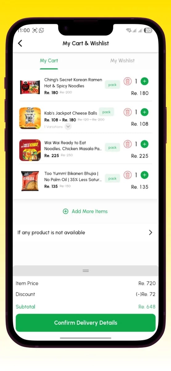
The cart shows every item with its price and quantity, and lets customers adjust or remove things easily. A running summary shows the item price, any discount and the subtotal, so the customer always understands what they will pay.
Next to the cart sits the wishlist, a place for products customers want to keep an eye on or buy later. Moving an item from the wishlist into the cart takes a tap, which helps people plan their shopping across several days.
A clear action to confirm delivery details completes the cart. It takes the customer to the final step with confidence, because everything above it has been visible and understandable.
- Editable items
- Price, discount and subtotal
- Wishlist alongside the cart
- Confirm delivery details
Delivery details and a confident finish
The final step asks for what the rider needs to find the customer: the address, any directions and contact details. Saved addresses make repeat orders quick, and a map pin helps with the places where addresses are informal.
The order summary is shown once more, in full, with the payment type. Customers can place the order knowing exactly what will happen next.
Once ordered, the customer gets an immediate confirmation and can follow the status. The experience is designed so that the moment of paying feels calm and certain.
- Saved addresses
- Map pin for locations
- Full order summary
- Immediate confirmation
A rider's whole job in one app
The OkPasal Delivery app equips riders with everything they need. New orders arrive as real-time notifications, and after accepting an order, the rider sees the full details: customer name, address, items and payment type. Nothing needs to be asked over the phone.
Integrated navigation takes the rider to the customer quickly. A guided delivery workflow walks through each step, which reduces errors and delays, especially for new riders.
When the order arrives, the rider captures a photo or a signature as proof of delivery, and records cash collected or verifies an online payment. Everything is documented in one place.
- Real-time notifications
- Full order details
- Integrated navigation
- Proof of delivery and payment collection
Riders and the team, with clear numbers
The rider dashboard shows daily tasks, completed deliveries, an earnings summary and performance. Seeing their own numbers helps riders trust the system and motivates reliable service.
Account management is simple: riders sign up, log in and update their profile whenever they need to. The aim is to make joining and working with OK Pasal as easy as the shopping experience is for customers.
For the OK Pasal team, the same information supports planning. They can see how deliveries are going, how riders are performing and where the service needs more capacity, which keeps the promise of fast delivery realistic as demand grows.
- Daily tasks and completed deliveries
- Earnings summary
- Simple rider accounts
- Insight for the team
Who uses it
Built for every side of the product
Households
Families, students and professionals ordering everyday essentials. They want simplicity, fair prices and fast delivery.
Riders
Delivery partners who carry out orders. They need instant notifications, navigation and an easy way to prove delivery and record payment.
Store and operations team
The people preparing orders and managing the catalogue. They need accurate orders and clear visibility of stock.
Founders
The people growing OK Pasal. They need insight into sales and delivery performance to decide where to improve.
The challenge
What had to be solved
The first challenge was ease of use for everyone. The customers of a local grocery service include people who are new to shopping apps. A cluttered screen or an unclear step would turn them away. The app had to be simple enough to learn in a moment, with big controls, clear words and a layout that does not hide important actions.
The second challenge was speed. A promise of delivery within about an hour depends on everything working together: the order reaching the store, the items being picked, the rider being assigned and the route being efficient. Each handover had to be fast and visible, with little room for confusion or delay.
The third challenge was clarity of money. Customers must see the item price, discounts, delivery fees and the final amount before they confirm. Riders must know whether to collect cash or confirm an online payment. The business must be able to reconcile every order. Making those three views consistent was a central piece of the design.
The fourth challenge was proof and accountability. When a delivery is made, both sides need evidence that it happened correctly. Photos or signatures as proof of delivery, together with clear status updates, protect customers from missing orders and protect the business from disputes.
The fifth challenge was scale without losing character. As order volume grows, a service can start to feel impersonal and unreliable. We designed the apps and the operations tools so that the team can keep standards high with more orders and more riders, using clear statuses, good records and early warning of problems.
Project goals
- Make everyday grocery shopping simple for every household.
- Deliver within about thirty minutes to an hour.
- Show prices, discounts and totals clearly before ordering.
- Let customers keep a cart and a wishlist.
- Give riders a dedicated app with navigation and proof of delivery.
- Give the team clear visibility of orders, riders and sales.
Scope
What a product like this covers
Home and search
A quick start to shopping with search and category icons.
Category browsing
Product grids with sub-categories and one-tap add.
Item pages
Larger images, brands, prices and size choices.
Cart
Editable items with price, discount and subtotal.
Wishlist
A place to keep products for later and move them into the cart.
Delivery details
Saved addresses, map pins and clear directions.
Payments
Payment types recorded for every order, including cash collection.
Order status
Confirmation and progress updates for customers.
Rider notifications
Real-time alerts for new orders.
Navigation and delivery steps
Integrated maps and a guided delivery workflow.
Proof of delivery
Photos or signatures to confirm a successful delivery.
Rider dashboard and admin
Tasks, earnings and performance for riders, with oversight for the team.
Design principles
The rules we designed by
If your mother can use it, anyone can
This was the co-founder's own test, and it shaped our decisions. We used plain words, big controls and short flows, so that people who are new to apps feel at home from the first screen.
Local trust, digital speed
Customers trust their local shop because they know it. We built the app to carry that familiarity into the digital world, with clear prices, honest messages and a service that behaves the way a good shopkeeper would.
Fewer taps, fewer mistakes
Every extra step is a chance for an error. We trimmed flows to the essentials, and used defaults and saved details to make repeat orders almost effortless.
Evidence builds confidence
Proof of delivery, clear receipts and visible statuses protect both customers and the business. They make disputes rare and easy to resolve when they do occur.
Design for the rider's reality
Riders work outdoors, in traffic and on the move. We designed the delivery app with large targets, high-contrast text and a guided flow, so that it works in real conditions.
Stay close to the neighbourhood
The business is rooted in Pokhara. We kept the product flexible enough to reflect local preferences, products and delivery realities as the service grows.
Plan for the busy hour
Evening and weekend peaks are when households order most. We designed the apps and dispatch so that service quality holds when many orders arrive together, since that is when a grocery service earns or loses trust.
Engineering
The decisions behind the build
A catalogue built for speed
Products, sizes and categories are structured so that browsing and search feel instant, even with a large range of goods.
One order, many views
The customer app, the rider app and the admin tools share one order record, so everyone sees the same state.
Real-time dispatch
Orders reach riders the moment they are ready, which supports the promise of fast delivery.
Evidence for every delivery
Photos, signatures and payment records are stored with each order, creating a reliable trail for customers and the business.
Resilient maps and navigation
Navigation is integrated into the delivery flow, with attention to places where addresses are informal.
Operational reporting
Reports on sales, deliveries and rider performance give the team the information to run the service well.
Process
From brief to live release
- 1
Learn the neighbourhood
We start by understanding how households in Pokhara shop, what they expect and where existing options fall short.
- 2
Design customer and rider journeys
We design the shopping and delivery flows together and prototype them for quick feedback.
- 3
Build catalogue and order core
We create the catalogue, the order lifecycle and the payment records first, since both apps depend on them.
- 4
Develop the apps
Customer and rider apps are built in short sprints with working builds to try each time.
- 5
Test with real deliveries
We run real orders, including cash collection and proof of delivery, to uncover issues no demo would show.
- 6
Launch and refine
We support the launch, listen to early customers and riders and keep improving the flows.
Screens
OK Pasal app screenshots
Quality and trust
How we keep it reliable
End-to-end order testing
We test the entire path from cart to delivery and payment, including cancellations and changes.
Usability checks
Customers and riders try the apps early so that unclear steps are found and fixed.
Money accuracy
Totals, discounts, cash collection and online payments are verified so that records always match.
Notification reliability
New orders must reach riders instantly, so we test alerts across device states and networks.
Data protection
Customer information is shared only with those who need it to complete an order.
Monitoring
Once live, errors and delayed orders are tracked so that they can be solved quickly.
“My mother orders her groceries on Ok Pasal now. If she can use it, anyone can. That was my only test, and it passed.”
OK Pasal
Co-founder, OK Pasal, Pokhara
Looking back
What this project taught us
OK Pasal is a product whose success is measured in ordinary moments: a family getting dinner ingredients on time, a rider finding the right house, a shopkeeper seeing a clear order. None of these is dramatic, and that is the point. The goal was to make everyday shopping so easy that people stop thinking about the software at all.
It also showed us how much a simple test can guide a product. The idea that anyone, including a parent who is new to apps, should be able to order groceries kept the design honest. Whenever a feature added complexity, we asked whether it passed that test, and we adjusted until it did.
If you are planning a retail, grocery or delivery product, we would be glad to talk through how to design the customer experience and the delivery side together, so that fast delivery is a reality and not just a promise.
One last point is how much a good delivery workflow improves the business. When riders have clear details, navigation and proof of delivery, fewer orders go wrong. That means fewer refunds, fewer calls and more happy customers, which is the real return on investing in the rider experience.
About the OK Pasal project
Straight answers about how a product like this is planned, built and launched.
Still exploring? Let us help.
A small senior team, a developer assigned within 48 hours, and source code that is yours on full payment.
“Simple. Fast. My customers don't want to think, they want momo at midnight. The app does that.”
You can also write to us at hello@inflancer.com and our team will get back to you right away.
More case studies
Caller ID App
Callexa
Callexa is a communication platform that makes calls more meaningful, organised and transparent. Callers add a reason, recipients see it before they pick up, and calling, chatting, sharing and community support live together in one app.
Ride Sharing App
Yatra
Yatra is a ride-sharing app for bikes, cars and parcels. Riders set a pickup and drop-off, choose a ride and a fare, and follow their driver live on the map. Behind it sits the driver app and the operations tooling that keep a marketplace of trips running.
Flight Booking App
Damiticket
Damiticket is a flight booking platform for Nepal. Travellers search domestic flights, compare fares and classes across airlines and book in a few taps. We designed the search, comparison and booking journey so that choosing a flight feels as simple as it should.